DUration
One Month
Problem
Create a new beverage from scratch that is catered to health-conscious Gen-Zers while also making it modern and feeling visually fresh. The packaging design should be serialized and be able to stand out on a shelf.
Solution
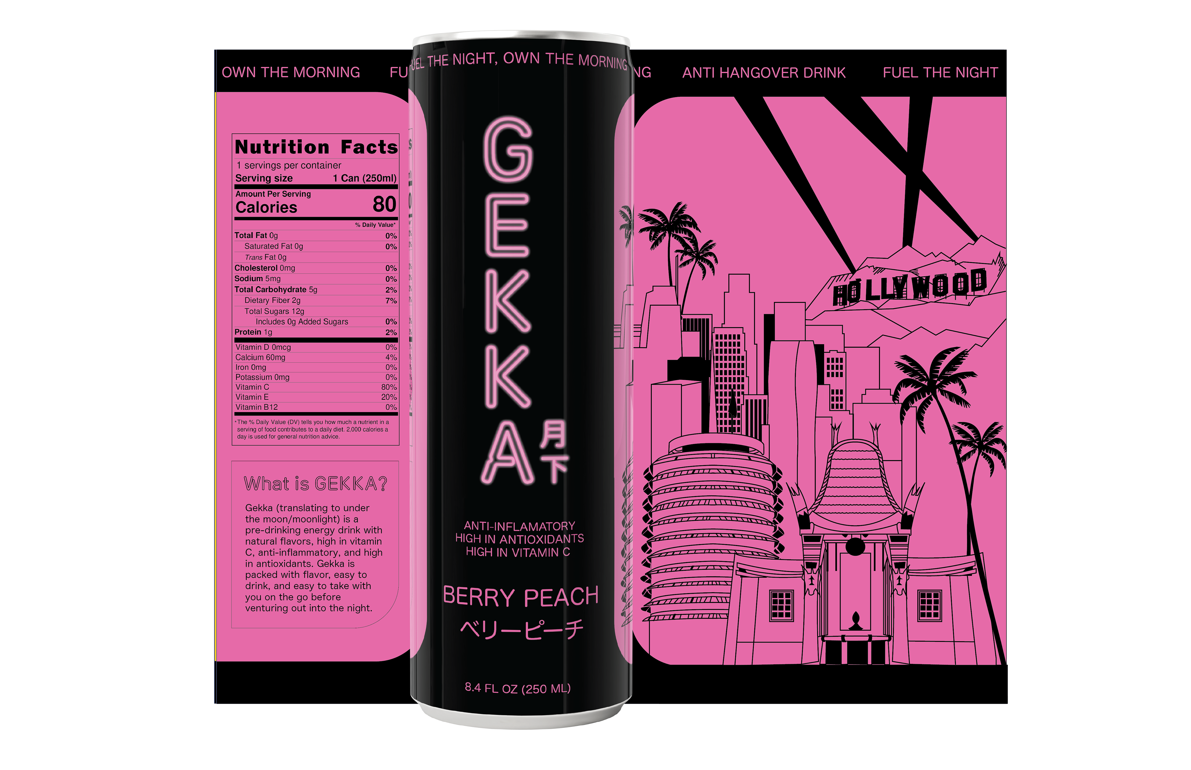
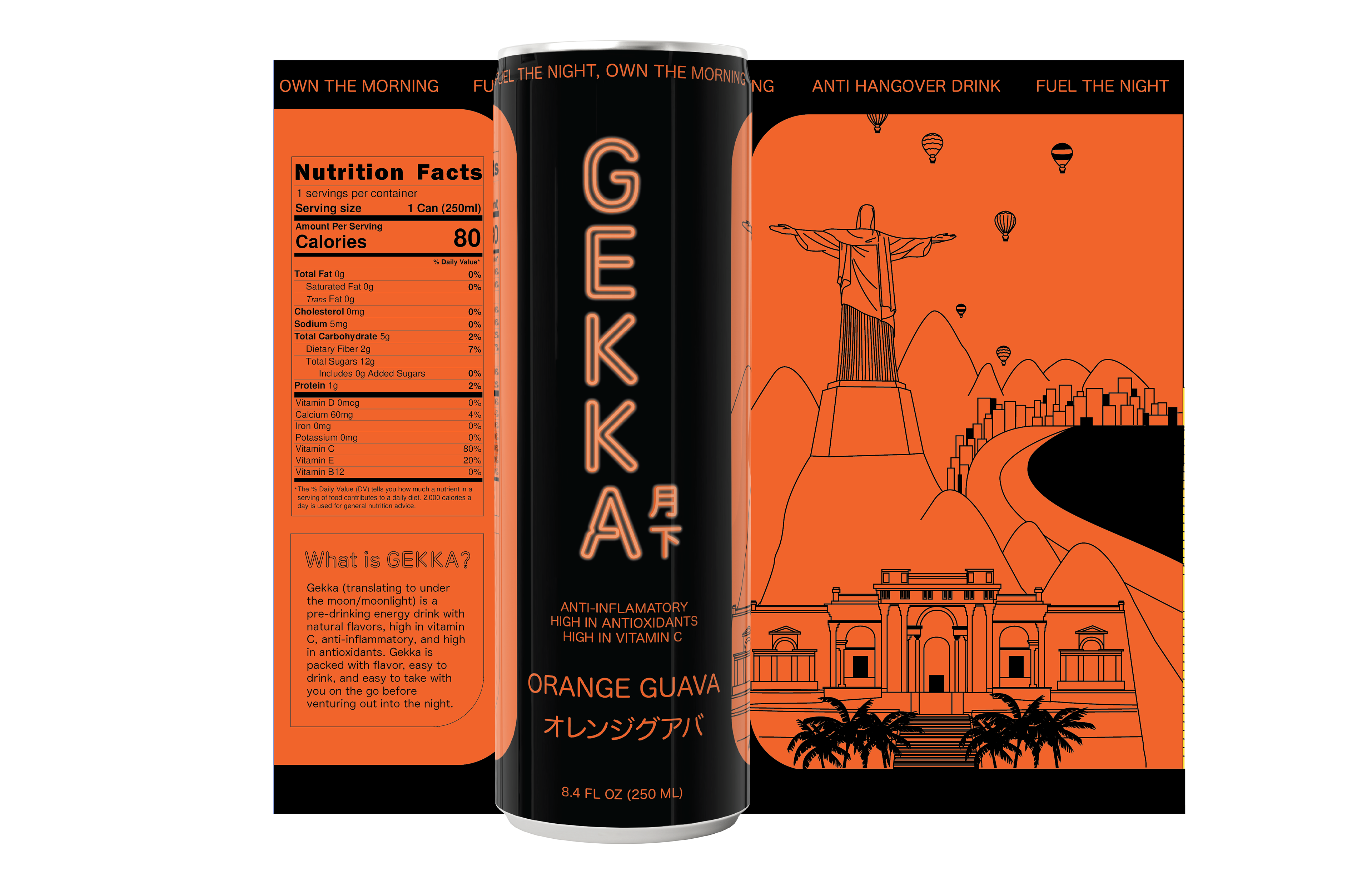
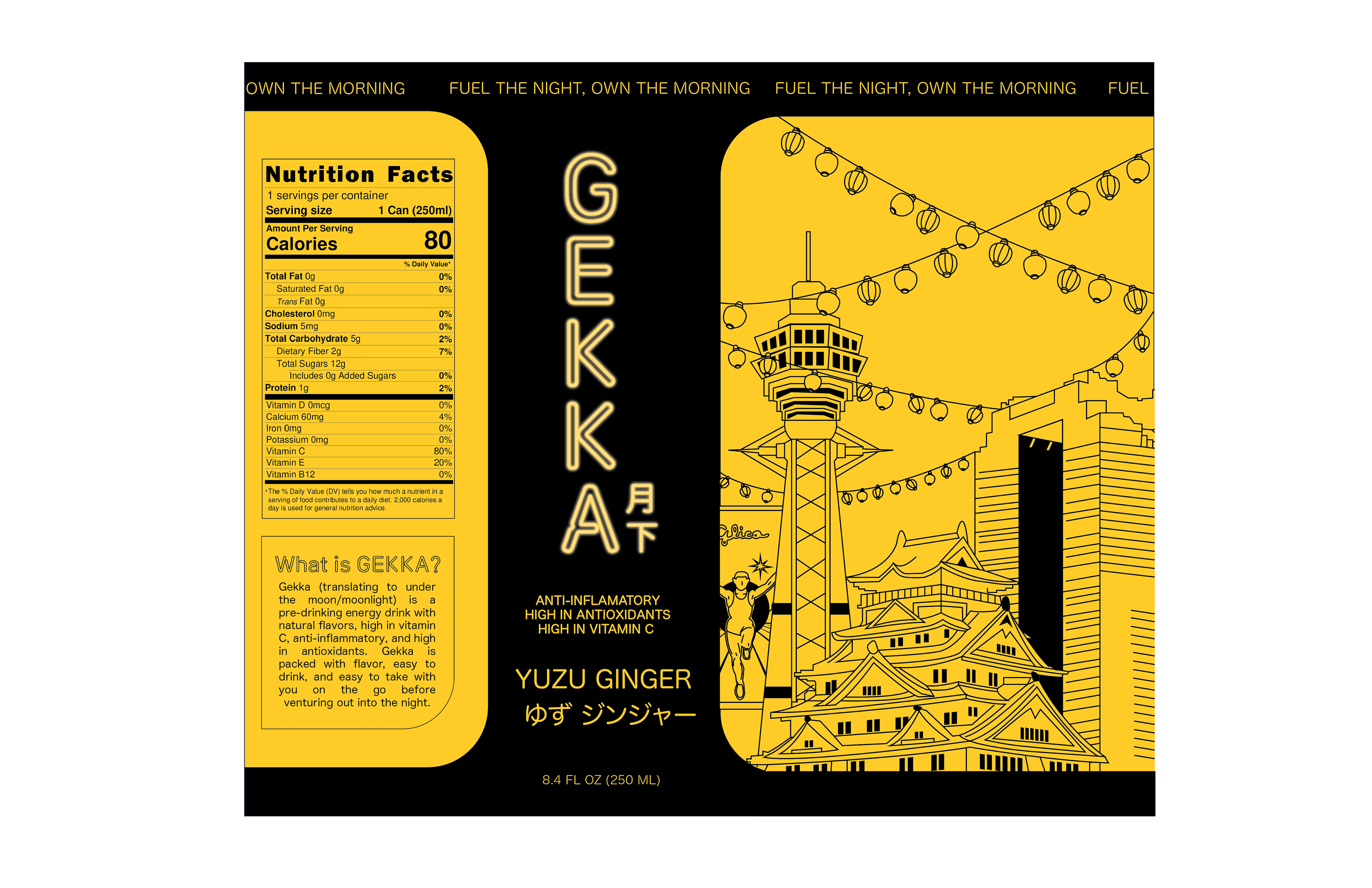
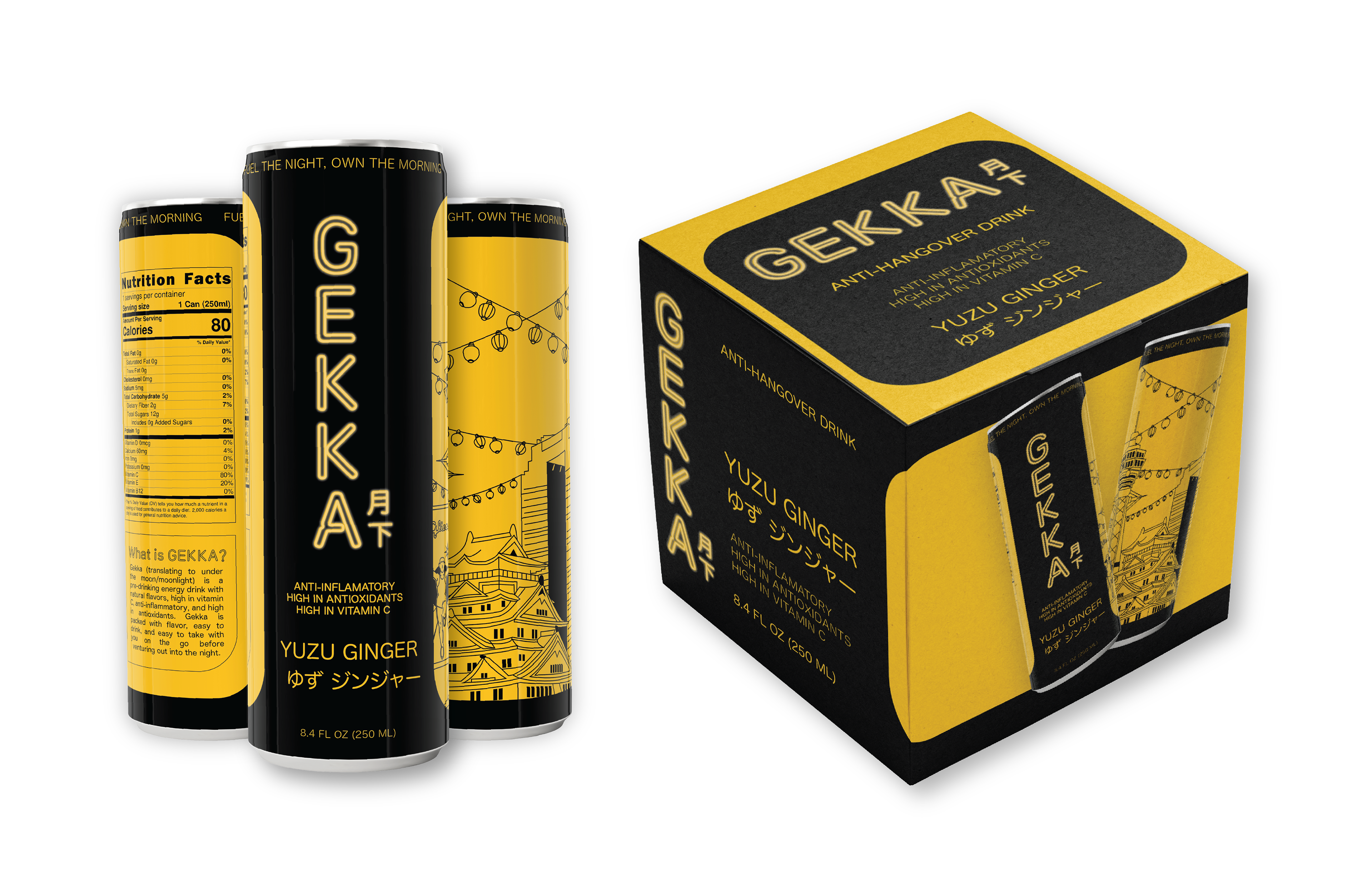
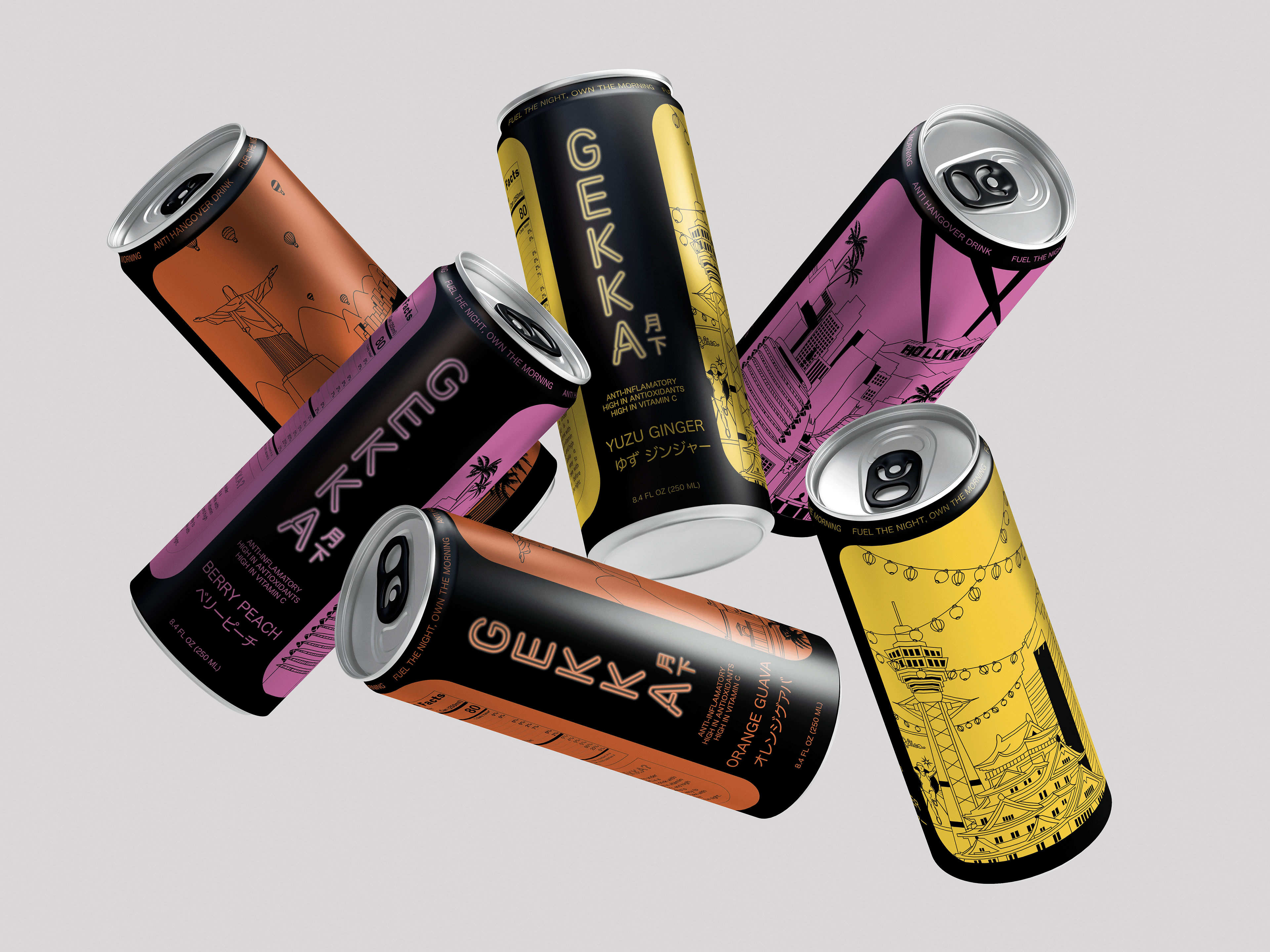
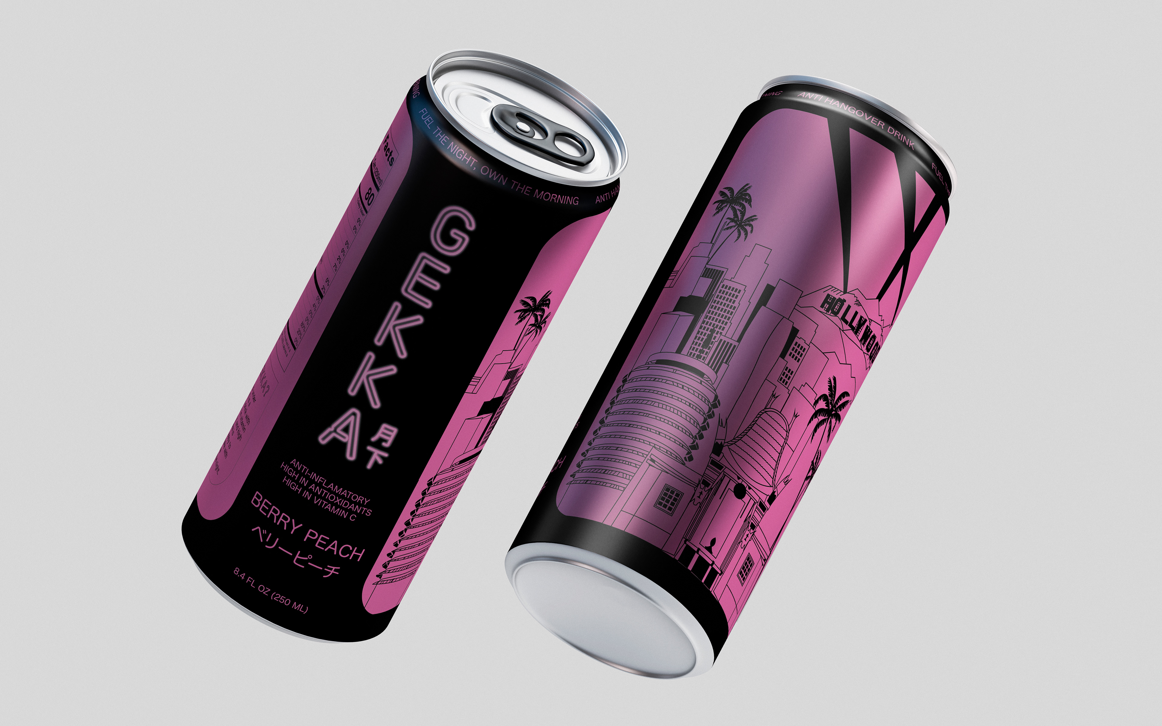
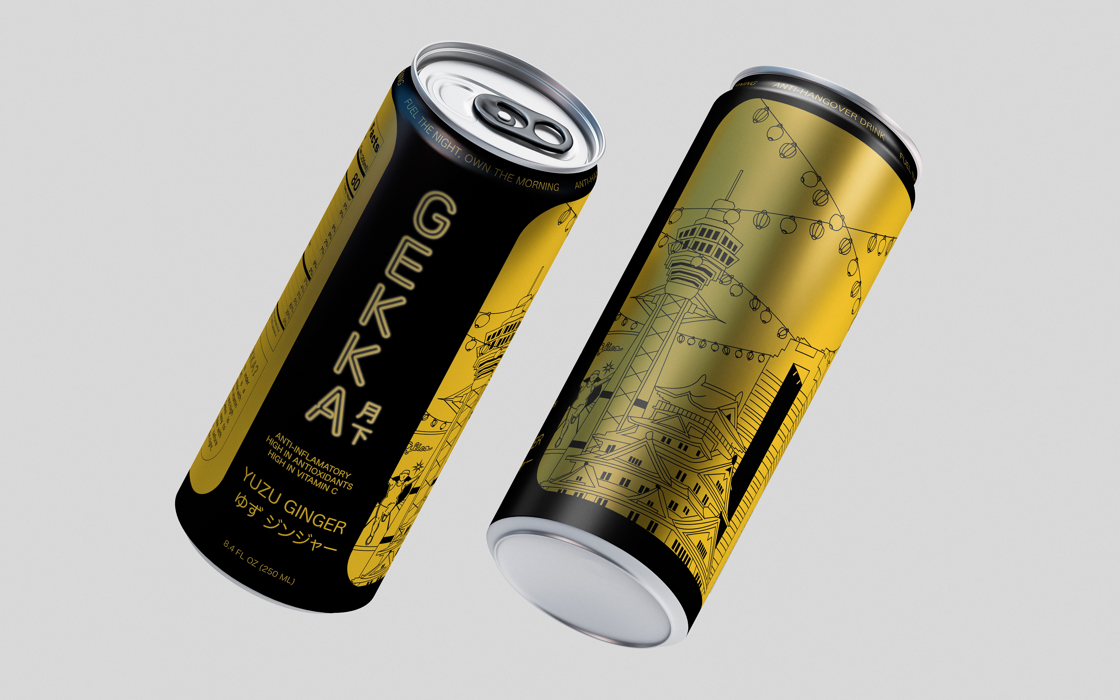
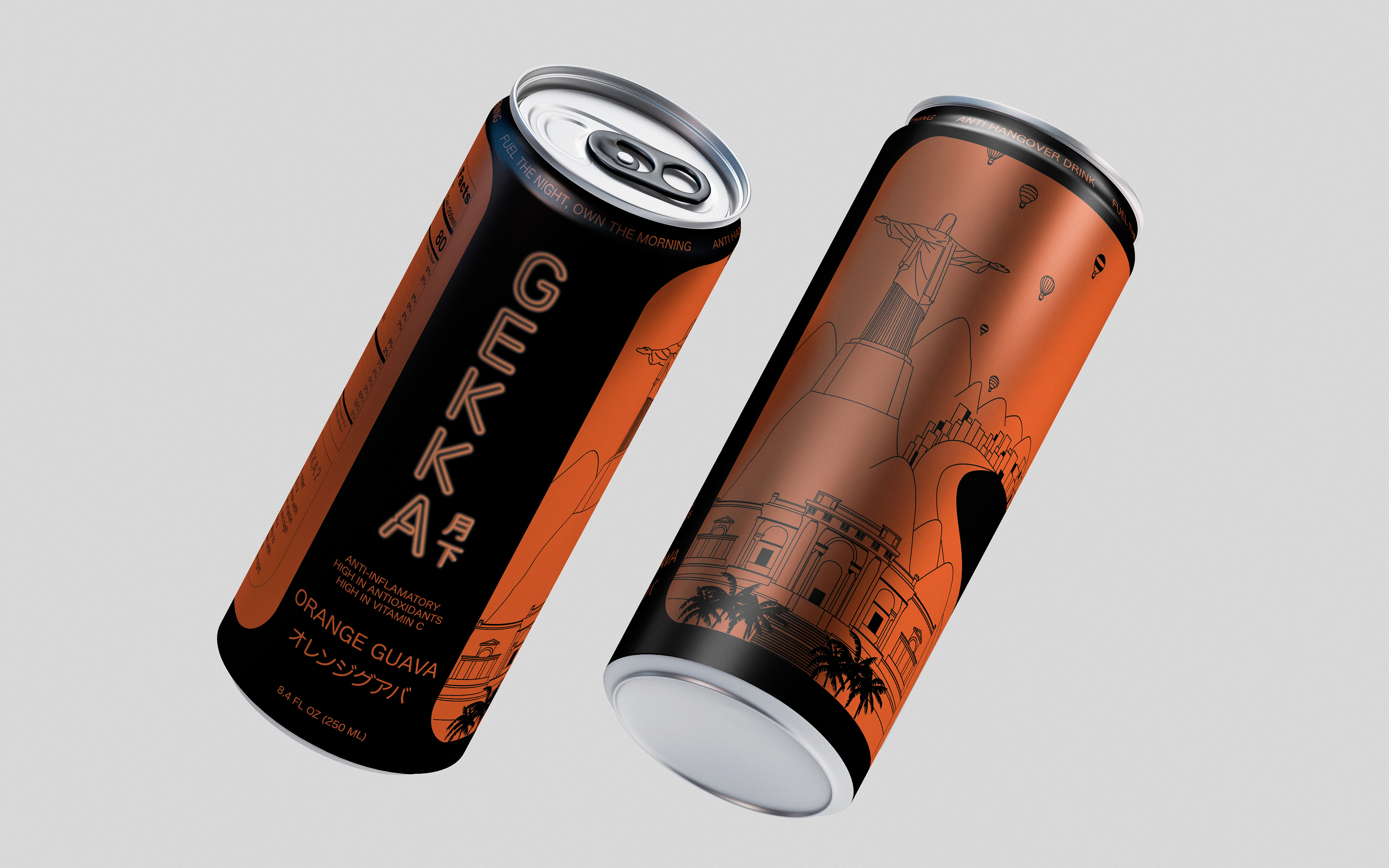
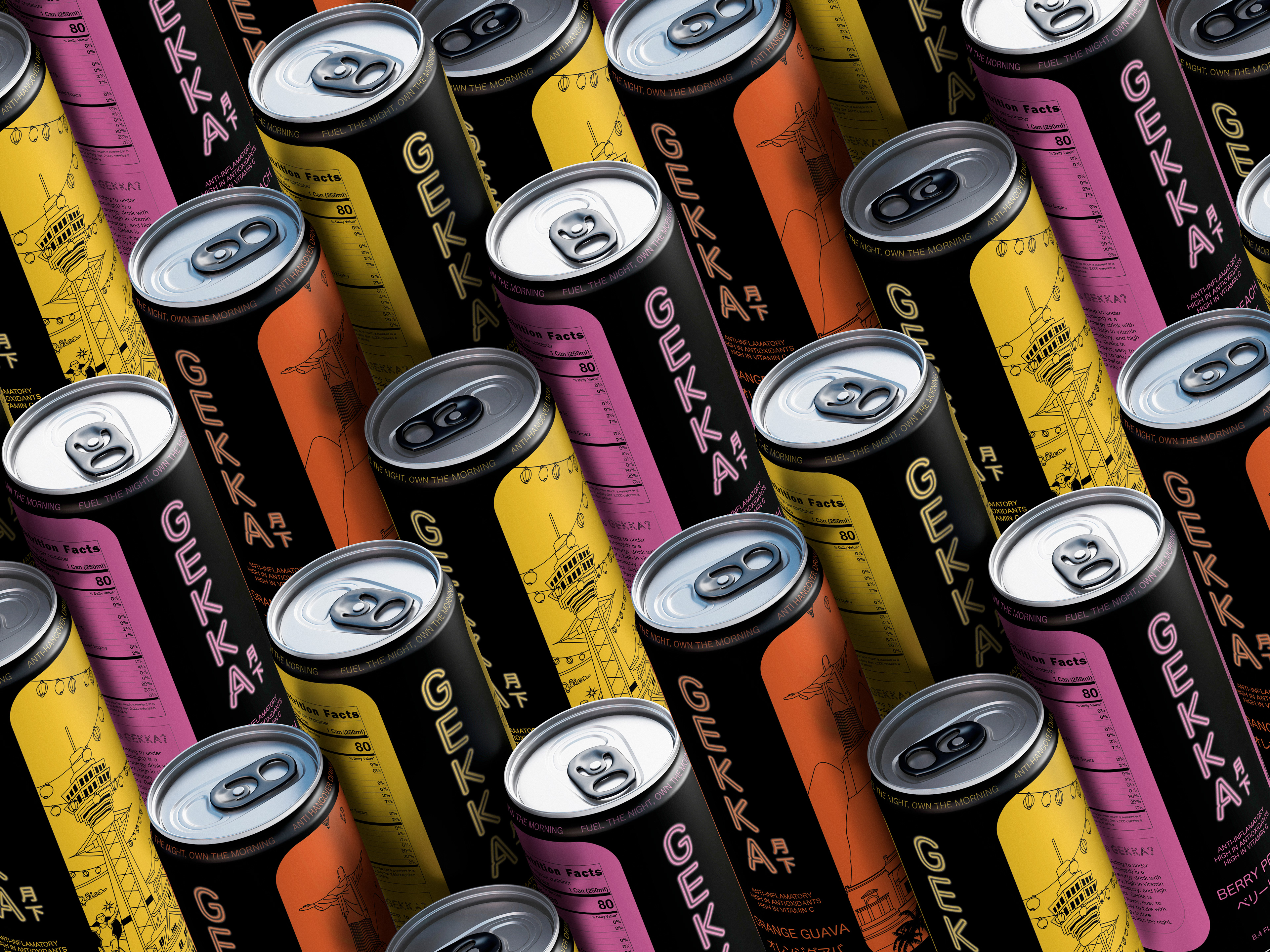
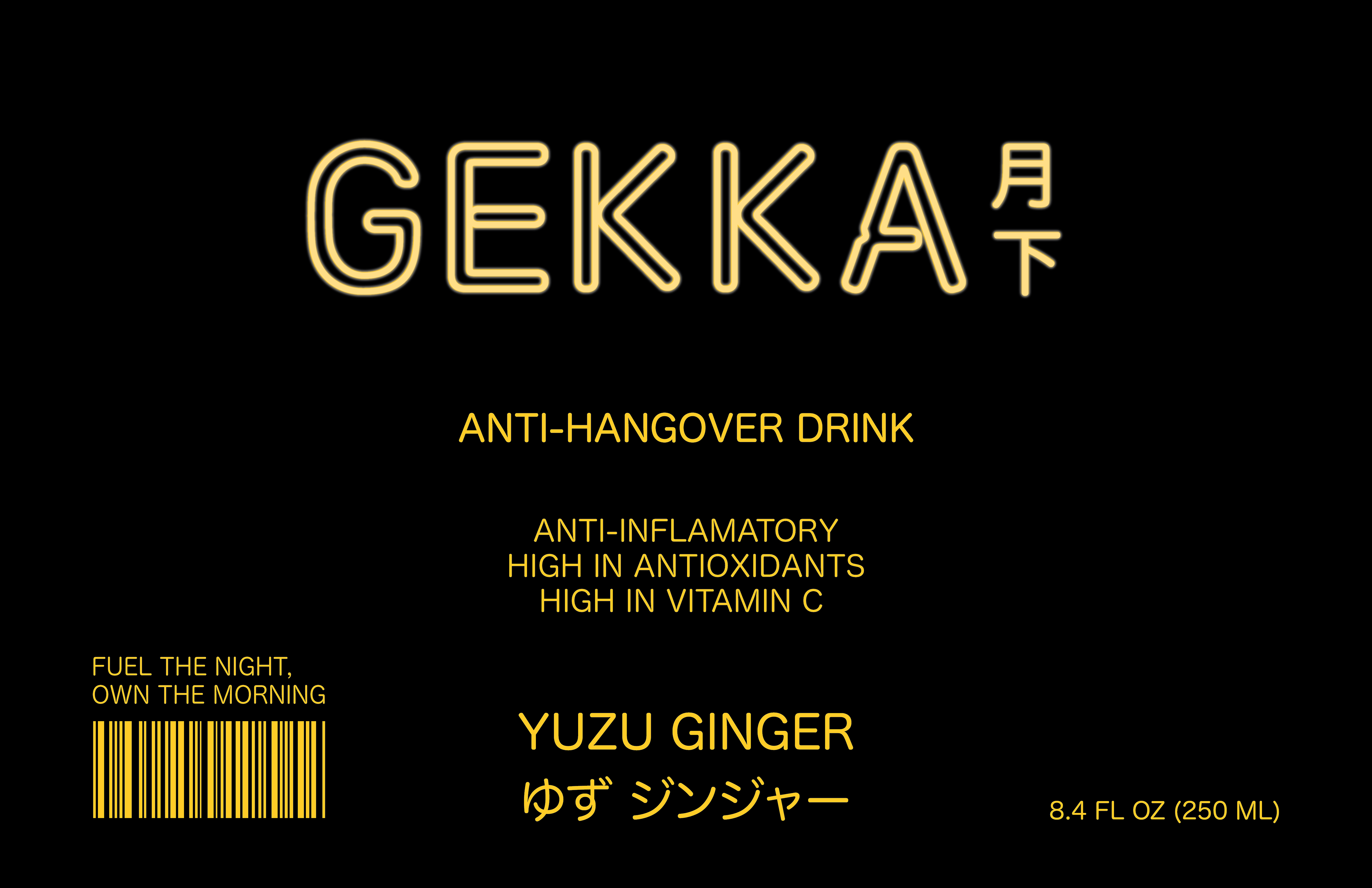
Gekka (translating to under the moon/moonlight) is a pre-drinking or anti-hangover energy drink with; natural flavors, high in vitamin C, anti-inflammatory, and high in antioxidants. Gekka’s target audience is Gen-Zers who enjoy partaking in nightlife culture. The design behind each Gekka flavor is unique, representing different major cities known for neon lights and a vibrant nightlife scene. Each can has two primary colors to make the packaging easily identifiable and eye-catching on a shelf.
Programs
Adobe Illustrator
Adobe Photoshop
Google Docs
INSPIRATION BEHIND GEKKA
I was deeply inspired by a popular beverage that can be purchased on nearly every street corner in Japan. A famous anti-hangover drink called Ukon no Chikara (the power of turmeric), is a small beverage that you drink before consuming alcohol to support liver health and physical wellness. As someone who had the experience of trying one and its effects, I was surprised to find out that there is nothing remotely similar on the market in the U.S.
While there are many alternatives, such as high-cost subscription pills, liquid IV, Tylenol, etc., there is nothing specifically designed for pre-alcohol consumption that is easily accessible, convenient, and catered to Gen-Zers.
Gekka pays a nod to this popular Japanese drink and my experience connecting with my Japanese culture while living abroad. Gekka is packed with flavor, easy to drink, and easy to take with you on the go before venturing out into the night.
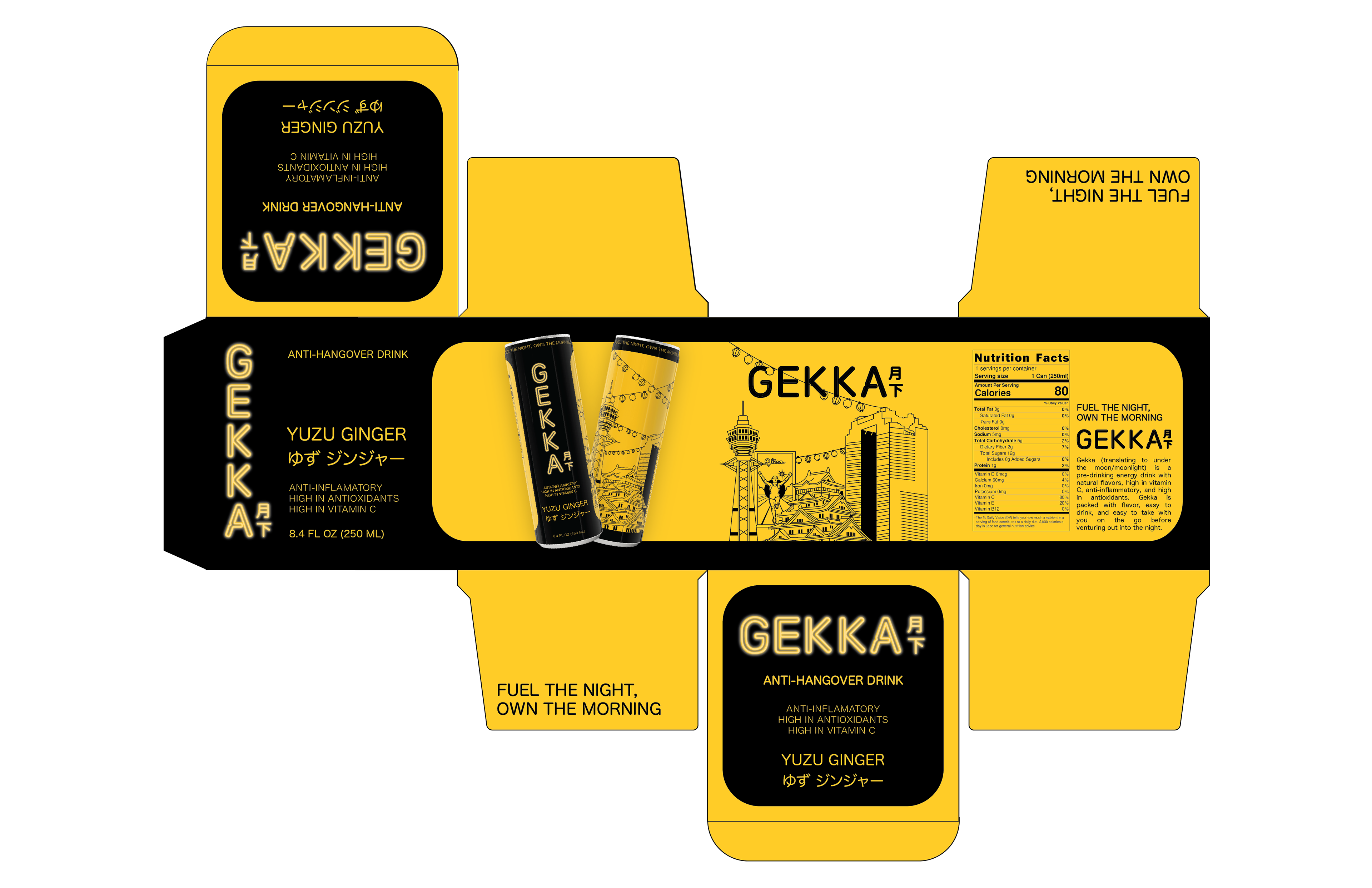
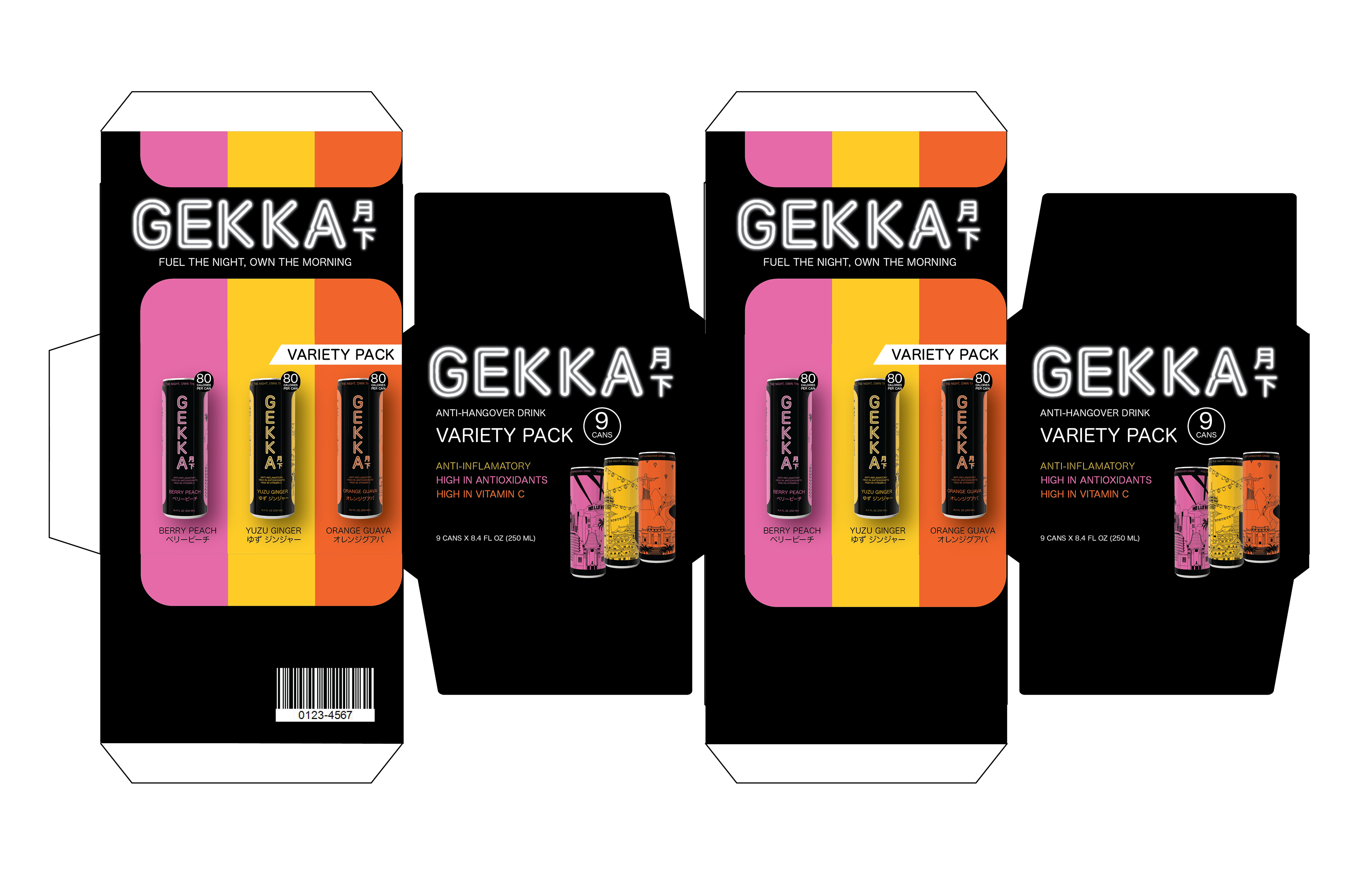
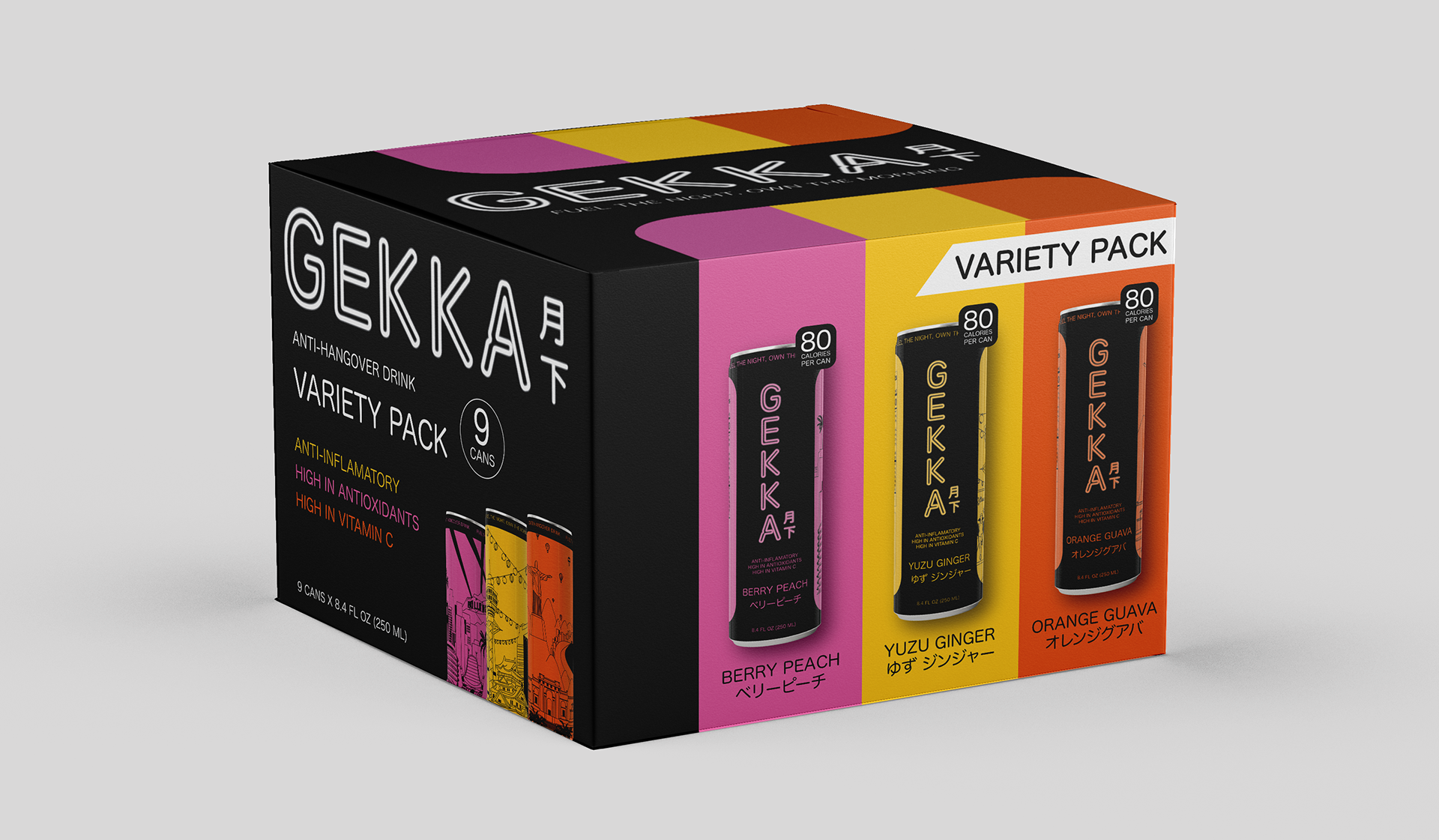
VARIETY PACK
For my variety flavor packaging, I wanted to create a design that was bold, sleek, and modern. I used a color blocking system to identify the three different flavored drinks. Another priority when designing the packaging was ensuring that the logo mark could be identified on both major and minor panels of the box.
The variety pack box has callouts such as:
- The amount of cans
- The health benefits
- Calories
- Flavor Profiles
SHIPPER DESIGN
I designed the shipper to mirror the visual hierarchy established on the can, ensuring consistency across the brand. While the hand-drawn illustrations featured on the can are intentionally absent from the shipper, this choice was made to maintain focus. The shipper prioritizes the brand name and beverage type, creating a clean, bold presentation without overcrowding the design. This deliberate simplicity reinforces brand recognition and allows the product name to take center stage.
Final dielines